We decided early on that we wanted to replace all of our hardwoods in the house before the baby was born (along with many other cosmetic changes, but this was the biggest). In October, my husband replaced the hardwoods in every single room over the course of 2 weekends, and it changed the whole look of our house. The nursery also needed new trim and a new closet interior (one long rod wouldn't cut it for baby clothes!). Those changes all happened over the winter, and it wasn't until January that I could really start decorating!
Designing a gender-neutral nursery was harder than I thought. The intention was that we would do all the basics upfront, and then layer in some gender-specific items after the baby arrived: a rug, pillows and wall art seemed to be the quickest updates, but they could also have a big effect on the room.
Interestingly enough, the very first purchase we made for the nursery was the dresser. I knew I wanted white, and that I didn't want to buy a set of nursery furniture. I wanted an eclectic, acquired-over-time look to the nursery; and in being honest with myself, I knew I would probably tire of the furniture sooner rather than later. I didn't want to spend a lot of money on something that I would want to change out in 2 years. So, I scoured Craigslist for a few weeks before finding an old Pottery Barn dresser looking for a new home. We went to check it out, and it was in great shape with a few paint chips and scuffs, and only $150... exactly what we were looking for!
After the dresser was purchased, I moved onto fabric, and I quickly fell in love with a swatch of the Slate Seersucker from Serena & Lily. Using that as my starting point, I tried to find corresponding fabrics that would complement the seersucker, but still be strong enough to stand on their own. Erika's nursery was my inspiration for the bedding; I thought it was a great combination of color and pattern, and that I could make it work for a boy or a girl. As I was shopping for bedding, I was also trying out paint swatches on the wall - trying to find that perfect grey/blue. At the last minute, I decided to get a sample of Calming Grey from Sherwin Williams. As soon as that went up on the wall, I knew it was the one!
The nursery slowly fell into place over the next 4 months. I collected things I loved, and the room came together just how I had envisioned. During those last few weeks before the baby was born, I would sit in here and just dream about this little person we were about to meet. The nursery quickly became my favorite room in the house! Of course, it wasn't complete until we met our little baby boy.
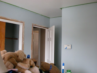
Here are some picture of the room in-progress:
Here is the nursery before we left for the hospital!
I will share some new pictures of the nursery soon. When we brought our little boy home from the hospital, we made some quick updates to make the room a little more masculine. And now, 15 months later, we've made even more changes to accommodate our on-the-move toddler!
Nursery Sources
Paint: Comfort Grey by Sherwin Williams (color matched to Olympic's no-VOC paint)
Trim Color: Woodlawn Whitwash by Behr (color matched to Olympic's no-VOC paint)
Dresser: Pottery Barn (via Craigslist)
Dresser Knobs: Hobby Lobby
Crib: Kendall Fixed Gate Crib from Pottery Barn, gifted from my parents
Bedding: Tiptoe Studio via Etsy
Changing Pad: Graham Changing Pad from Serena & Lily
Curtains: Tiptoe Studio via Etsy
Blinds: JCPenney
Antique Herb Crates: Farmhouse Wares
Lamps: HomeGoods
Elephant Planter: family antique
Chair: IKEA
Throw: HomeGoods
Floating Shelves: Pottery Barn (via Craigslist)
Frames on Shelves: HomeGoods and Hobby Lobby
Elephant on Shelves: family antique
Table: IKEA (spray painted white)
Frame on table: Kate Spade
Elephant Artwork & Frame: Sunday Afternoon by Shari Beaubien (via AllPosters.com)
Chocolate Lab Print (on shelves): Otis Sewn Print by TastesOrangey via Etsy
'Whole Heart' Artwork: DIY
I'm linking up with Kelly's Korner for Show Us Your Life (SUYL - Nurseries)!


What an adorable nursery! I LOVE the vintage herb boxes for displaying books.
ReplyDeleteThanks Emily! :)
DeleteLovely. I particularly like the graduating baskets on the wall. I've popped over from Kelly's Korner.
ReplyDeleteThanks Caitlin! :)
DeleteLove love love. The baskets on the wall are perfect.
ReplyDeleteLove this
ReplyDelete